A Tale of Two Maps: Education and Politics in America
If Democrats are Bachelors, and Bachelors are Degree-Holders, are all Degree-Holders Democrats?
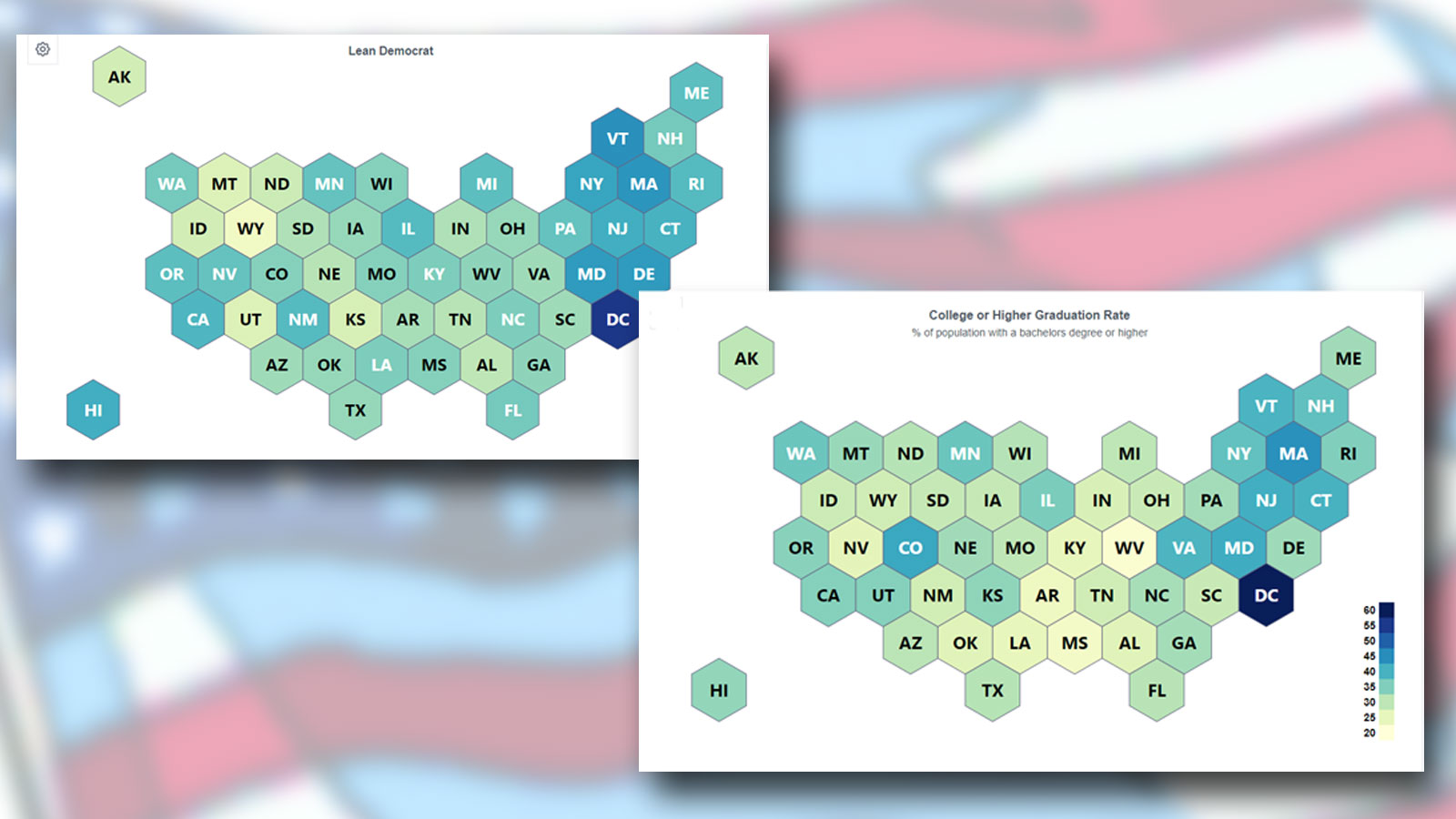
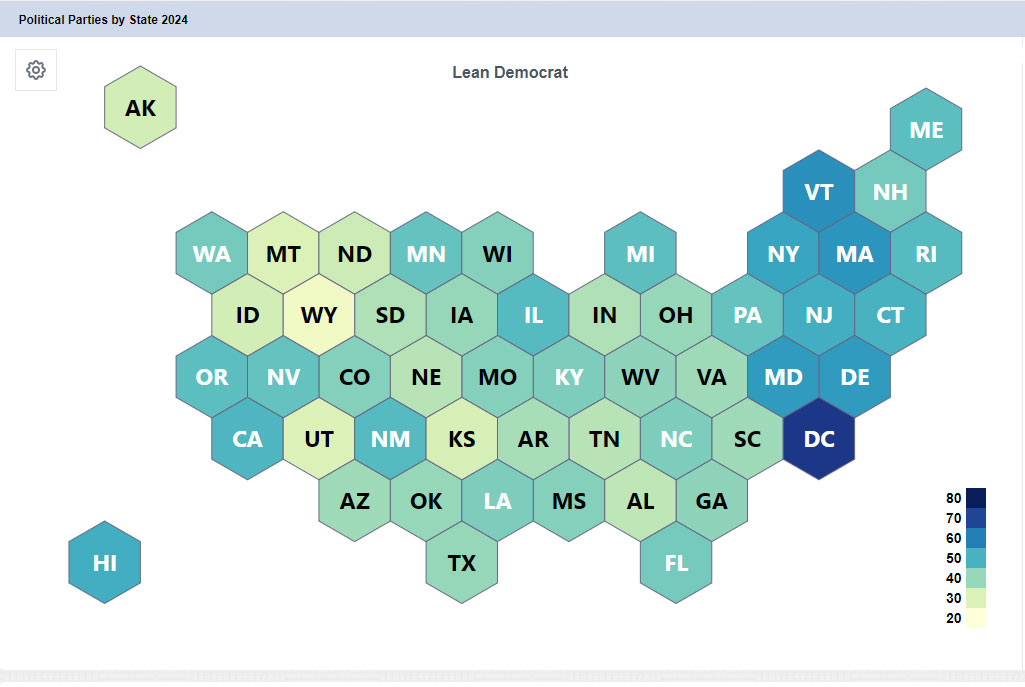
Can you spot the difference between these two maps?
Apart from the title, they are strikingly similar.
One shows Percentage of Democrat-leaning voters by state:
The other – Percentage of population with a bachelor’s degree or higher:
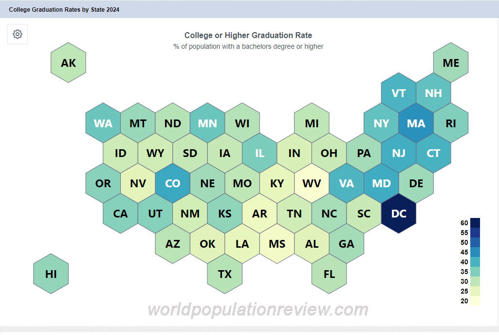

The alignment is uncanny. Statistical analysis of the data (from worldpopulationreview.com) reveals a strong positive linear relationship between attained education level and Democratic Party leaning for US states..
What might this relationship suggest about the interplay between education and political affiliation in the United States?
Yes, correlation doesn’t imply causation. For the data-driven among you, r = 0.63, p<0.0000007,
This is hardly a coincidence. Perhaps we should dig deeper, especially if you are still thinking about who to vote for.
How could this impact business outcomes, societal trends, or even the state of democracy worldwide?
I answered a similar question earlier, and I will summarize it here: I have some really bad news for Democrats. This divide suggests educated voters lean Democratic, yet with fewer numbers, which could reshape the future of democracy. Historically, Democrats have benefited from higher turnout, but in a landscape flooded with propaganda, the GOP may gain an edge. In fact, it aligns with a version of the Pareto principle: “80% of brains belong to 20% of bodies.” Sadly unpleasant – but especially true in the coming election.
What implications do you see for your industry or the upcoming elections?
Share your thoughts and insights below.